You can have a great app idea and powerful features, but if users find the app confusing, they probably won’t stick around. They’ll open it once, get lost, and quietly delete it.
That’s the part most first-time app builders underestimate. Features get all the attention. UI and UX quietly decide whether anyone actually uses those features.
Here’s where many apps struggle: they’re built around what the founder wants to show, not what the user is trying to get done. The result is cluttered screens, confusing navigation, and onboarding that scares people off before they see any value.
That’s where ChatGPT becomes useful. It won’t replace a designer, but it’s a fantastic thinking partner for mapping out user flows, planning screen layouts, and catching usability problems before you write a single line of code.
This guide gives you the exact prompts to do that.
Can ChatGPT Help With App UI/UX Design?
Yes, with the right prompts, ChatGPT can meaningfully speed up your design process.
It’s especially good at:
- Mapping user flows from first open to key action
- Planning navigation structures and information architecture
- Suggesting wireframe layouts for specific screens
- Improving onboarding sequences
- Organizing features by priority and usage frequency
- Spotting friction points in an existing design
If I were designing an app today, I’d use ChatGPT the same way I’d use a smart, fast collaborator in a whiteboard session — not to hand me a finished design, but to help me think through the logic before a designer or no-code tool brings it to life.
Here’s the honest limitation: ChatGPT can’t see your actual app, test it with real users, or generate pixel-perfect visual designs. It works with text and structure, not visuals. Think of it as your UX strategist, not your visual designer.
The Best ChatGPT Prompt for App UI/UX Design
If you only use one prompt from this article, use this one. It forces ChatGPT to think through your app’s UX from the user’s perspective, not just list generic design tips.
Act as a senior UX strategist. I’m building an app called [app name] for [target user]. The main goal a user wants to accomplish is [core user goal]. Walk me through: 1) the ideal user flow from opening the app to completing that goal, 2) the key screens needed and what should appear on each, 3) where users are most likely to get confused or drop off, and 4) three specific changes that would reduce friction and improve retention. Be specific and practical, not theoretical.
Why It Works
This prompt anchors everything to one core user goal instead of trying to design your whole app at once. It also forces ChatGPT to flag drop-off risks, which is usually the part founders skip until it’s too late.
When To Use It
Use it early, right after you’ve defined your app’s core feature. It works well before you sketch a single wireframe, and it’s just as useful later if you’re trying to figure out why users aren’t sticking around.
Pro Tip
Run this prompt separately for each major user goal in your app. A to-do app, for example, has a different ideal flow for “add a task” than it does for “review today’s list.” Treating them separately gives you sharper, more useful answers.
The UI/UX Framework Every App Should Follow
Before jumping into specific prompts, it helps to have a simple framework in mind. I use this one:
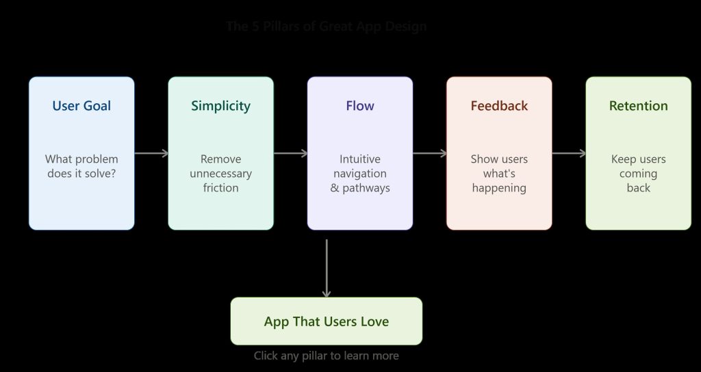
USER GOAL + SIMPLICITY + FLOW + FEEDBACK + RETENTION
User Goal — What is the person actually trying to accomplish right now? Every screen should serve this.
Simplicity — Can you remove a step, a button, or a field without losing function? If yes, remove it.
Flow — Does one screen lead naturally into the next, or does the user have to stop and think about where to go?
Feedback — Does the app confirm what just happened? A saved task, a sent message, a completed step — users need to see it worked.
Retention — Does the experience give users a reason to come back tomorrow, not just today?
This framework works alongside the bigger picture too — if you’re still validating your idea or planning your MVP, it’s worth backing up to the full ChatGPT prompt to build an app before diving deeper into design.
ChatGPT Prompts for User Flow Design
User Journey Mapping
Prompt
Map the full user journey for someone using [app name] to [core goal], from the moment they open the app to the moment they complete the goal. List each step, what the user sees, and what action they take.
What It Does
Breaks your app down into a step-by-step sequence instead of a vague mental picture, so you can spot unnecessary steps.
Example
For a budgeting app, this might reveal that users have to pass through three setup screens before they can log their first expense — a clear candidate for simplification.
Pro Tip
Ask ChatGPT to count the total number of steps. If it’s more than five or six for a core action, ask it to suggest ways to cut that down.
Navigation Planning
Prompt
Suggest a navigation structure for an app with these core features: [list features]. Recommend whether to use a tab bar, hamburger menu, or hybrid approach, and explain why based on how often each feature is used.
What It Does
Helps you decide how users move between sections based on actual usage patterns, not guesswork.
Example
A social app with four daily-use features and two rarely-used settings pages would likely get a tab bar for the four, with settings tucked into a profile menu.
Pro Tip
Tell ChatGPT which features you expect users to use daily versus occasionally. This single detail dramatically improves its navigation suggestions.
Task Completion Flows
Prompt
Design the step-by-step flow for a user completing [specific task] in my app. Minimize the number of taps and decisions required. Flag any step that could be automated or removed.
What It Does
Focuses specifically on one task rather than the whole app, which usually produces sharper, more actionable feedback.
Example
For an expense-tracking app, this might streamline “add expense” from five fields down to two, with the rest auto-filled or optional.
Pro Tip
Ask ChatGPT to imagine the user is doing this task one-handed on their phone while distracted. It’s a simple framing that surfaces real friction.
Onboarding Flows
Prompt
Design a 3-screen onboarding flow for [app name] that helps a new user understand the core value of the app within 30 seconds, without requiring account creation first.
What It Does
Keeps onboarding short and focused on value, rather than front-loading forms and permissions before users see any benefit.
Example
A fitness app might show a quick “pick your goal” screen, a preview of a sample workout, and then ask for sign-up only once the user is engaged.
Pro Tip
Push ChatGPT to justify every single onboarding screen. If it can’t explain why a screen needs to exist before sign-up, cut it.
ChatGPT Prompts for Wireframes and Screen Layouts
Home Screen Design
Prompt
Describe a home screen layout for [app name] that prioritizes [primary action]. List the elements from top to bottom, including what goes above the fold on mobile.
What It Does
Gives you a text-based wireframe you can hand to a designer or recreate directly in Figma or a no-code tool.
Example
For a to-do app, this might place “add task” as a floating action button, with today’s tasks front and center and completed tasks collapsed below.
Pro Tip
Ask for two layout variations, then decide which better supports your primary action.
Dashboard Design
Prompt
Suggest a dashboard layout for [app name] that shows [key metrics or data points] without overwhelming the user. Prioritize what should be visible immediately versus what can be tucked into a details view.
What It Does
Prevents the common mistake of cramming every metric onto one screen, which usually just creates visual noise.
Example
A SaaS analytics tool might surface only three headline numbers on the main dashboard, with deeper breakdowns available one tap away.
Pro Tip
Tell ChatGPT which single metric matters most to your users, and ask it to design around that one number first.
Feature Layout Planning
Prompt
I have these features: [list features]. Group them logically and suggest which should live on the same screen versus separate screens, based on how users would naturally use them together.
What It Does
Helps prevent feature bloat on a single screen by grouping related actions together.
Example
In a project management app, “assign task” and “set due date” would likely live together, while “team settings” would sit somewhere separate entirely.
Pro Tip
If ChatGPT’s grouping doesn’t match how you imagined the app working, that’s often a sign your original structure needs rethinking, not the AI’s suggestion.
Mobile Screen Structure
Prompt
Suggest a mobile-first layout structure for [screen name] that accounts for thumb reach, screen size, and one-handed use.
What It Does
Keeps design decisions grounded in how people actually hold and use their phones, not just what looks good on a desktop mockup.
Example
This might recommend keeping the primary action button in the lower third of the screen where thumbs naturally rest, rather than the top corner.
Pro Tip
If you’re planning a ChatGPT prompt to build a mobile app, run this prompt for every core screen before development starts, not after.
ChatGPT Prompts for Better User Experience
Reducing Friction
Prompt
Review this user flow: [describe flow]. Identify every point where a user might hesitate, get confused, or abandon the process, and suggest a fix for each.
What It Does
Acts like a lightweight usability review before you’ve spent money on real user testing.
Example
It might flag a signup form that asks for a phone number too early, before the user has seen any value.
Pro Tip
Paste in your actual screen descriptions or copy instead of a vague summary. The more detail you give, the more specific the friction points it can catch.
Improving Retention
Prompt
Suggest three UX changes that would give users a reason to open [app name] again tomorrow, based on its core feature of [core feature].
What It Does
Shifts your thinking from “does this work” to “does this pull people back,” which is the real test of good UX.
Example
A journaling app might get a suggestion to send a gentle streak reminder or show a “look back” prompt from a past entry.
Pro Tip
Ask ChatGPT to separate retention ideas into “notification-based” and “in-app design” categories, so you’re not relying on push notifications alone.
Simplifying Navigation
Prompt
Here’s my current navigation structure: [describe it]. Identify anything that feels redundant, confusing, or unnecessary, and suggest a simpler version.
What It Does
Gives you an outside perspective on a structure you’ve likely become too close to see clearly.
Example
It might notice that “Profile” and “Account Settings” overlap enough to be merged into one screen.
Pro Tip
Do this exercise again after you’ve built your first working version. Navigation problems are often easier to spot once the app is real instead of theoretical.
Improving Accessibility
Prompt
Review this screen description: [describe screen]. Suggest accessibility improvements related to text size, color contrast, tap target size, and screen reader support.
What It Does
Surfaces accessibility issues early, when they’re cheap to fix, instead of after launch.
Example
It might flag that light gray text on a white background will be hard to read for many users, not just those with visual impairments.
Pro Tip
Accessibility fixes usually improve usability for everyone, not just users who need them. Treat these suggestions as core UX improvements, not extras.
How I Would Use ChatGPT to Design an App Today
Here’s a smarter approach than jumping straight into wireframes.
Start with user research. Even informal — talk to five potential users about their current frustration with the problem you’re solving.
Create the user flow. Use the journey mapping prompt above to lay out the ideal path from open to goal completion.
Plan wireframes. Use the screen layout prompts to describe each key screen before any visual design work begins.
Prepare for UX testing. Ask ChatGPT to write a short list of tasks you can hand to test users, then watch where they hesitate.
Iterate. Feed what you learned from testing back into ChatGPT and ask for revised flows based on the real friction you observed.
This loop is fast, cheap, and catches most usability issues before they cost you development time.
Frequently Asked Questions
Can ChatGPT help with app UI design?
Yes. ChatGPT can suggest screen layouts, navigation structures, and design priorities in text form, which you can then hand to a designer or recreate in a design tool.
Can ChatGPT help create user flows?
Yes. It’s particularly strong at mapping step-by-step user journeys and flagging where users are likely to get confused or drop off.
Can ChatGPT help design wireframes?
ChatGPT can describe wireframe layouts in detail, including element placement and hierarchy, but it can’t generate actual visual mockups or pixel-based designs.
What is the best ChatGPT prompt for UX design?
The most effective prompts focus on one specific user goal and ask ChatGPT to map the flow, identify friction points, and suggest concrete improvements, rather than asking for generic design advice.
Can ChatGPT replace a UI/UX designer?
No. ChatGPT is a strong planning and brainstorming tool, but it can’t test with real users, create polished visual designs, or make the judgment calls a skilled designer brings to a finished product.
Conclusion
Great apps don’t win because they have the most features. They win because they help users accomplish something simply and quickly.
ChatGPT won’t design your app for you, but it’s an excellent thinking partner for mapping user flows, planning layouts, and catching usability problems early. Use it to sharpen your thinking, then validate everything with real users before you build.